


01 My involvement & Challange
What It was about?
My friend who was in the Gordic security department ask me if I would be willing to help them with the redesign. It sounded like a big challenge, so naturally, I had to say yes. I mainly designed the wireframes, interactions, and user flows. But also later on I created the visual design for emails and newsletters. Company was founded in 1993 as the software company which developed information systems. But there were a few problems
- General brand awareness that Gordic is the accounting company
- Gordic is a supplier of information systems for public institutions.
- People's often perception, due to historic circumstances is, that company that is doing something for the public sector is a also fraudster.
- Change the brand awareness
- Increase Leads generation
- Direct upsell of IS modules (like e-shop)
- Selling training courses
02 Understand
Assumptions or data?
Brand Awareness issue Gordic people felt on daily basis in many domains. They hired Czech marketing agency H1.cz to run a workshop where they analyzed the problems. This workshop had happened before my involvement and the outcome of the workshop served as the starting point for my ideation.
In the beginning, We lacked the data from the existing web. I quickly implemented at least Google Analytics and Hotjar to gather quantitative data and user interactions. We collected the data for three months and I spotted two trends. The majority of visitors visited two pages — Expert Training and Support center. People were looking for support articles and best practices, but it wasn't available on the web. This fact convinced the leadership to start a new project. I am describing it in this case study. Also, these two findings had an impact on the new information architecture and navigation
I've done simple research, where I discovered how the competitors (SAP, Stormwater, Vera, ICZ) communicate with the customer and how their product portfolio is structured. Why? Because then you can find a space for improvements and you’ll also see what you can do differently.

04 Design ideation & iterations
Designing the Core
Redesigning everything at once is always a bit dangerous and also kinda like a waterfall. I've proposed to go further in small design weekly increments and create the quick concept. Thanks to this lean approach, everyone had clear expectations. We've tested our collaboration at the very beginning and I was able to deliver the design fast.
From the very beginning, I've focused on training courses. This had a huge revenue potential
and was one of the most visited pages. Part of that was also a concept for the product page
and homepage. After this main iteration, I've come up also with the concept for the system
configurator.
05 First increment
Homepage
The homepage is usually about attention and interest. The first section should say that Gordic is a software company. Hence there was displayed the main digital product with a strong message. that was emphasized by The social proof emphasized all of that, plus it supported the credibility. The next section was about the product portfolio. I wanted to stress out, that they don't develop only accounting software.
One potential risk was a bad brand perception. Because of that, the following section was about the company, milestones, and values. There the visitor should find out, that they are responsible and very transparent with a long history. The last part was about the upcoming events. Surprisingly this was very important for the customer relationship.

Homepage interactions
The part of my job was to come up also with the wireframes for every interactions or possible situation. Below you can explore how the design looks like in different states, resolutions or variations.
-
01 Active menu 02 Active search -
03 Product section 04 Search result page -
05 Training calendar preview 06 Error page -
07 General product guide 08 Privacy statement -
09 Product catalogue 10 Mobile menu & search -
11 Mobile web version


06 Second increment
Expert training
The goal was to provide information about the expert training. Customer needs a different type of information in different stages of the customer journey. For pre-booking phase, the page provided information about the training overview and how it works(1). You can find info about the trainer(2) and sign up if there still was a free spot. On the top of the page, there was availability indicator(3).
The customer had also the option to set the reminder in case that the training hasn't had any free capacity(4). After booking people needed to know, how to get to training center, where to park the car (5). On the bottom I used the opportunity for cross-sell (6).

07 Third increment
Booking process
For booking, I designed a three-step process. In the first step user-added information about one or more participants. Why more? Because the company usually sends two or three people to join the training. The second step was about the invoice details. The last one was the overview where the user still could make changes. After that, there was a confirmation page where the user had the quick option to save the event into the calendar. I also wanted to include online payment via card, but it would complicate the internal invoice process. The company decided don't do that in the first version.
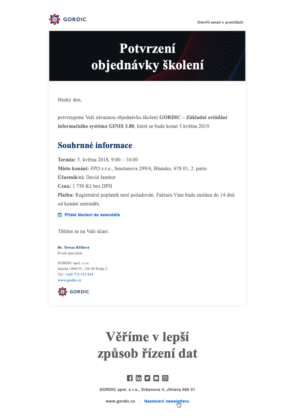
Email confirmation
The user also received the confirmation by the email. Emails were created in the later stage of the project and I directly created the visual version. Regarding the visual style, I consumed the style that was created by Officina studio.
08 Fourth increment
Product pages
The Gordic products are quite complex. Product, belongs(1) to a specific sector. Each product is composed of functional areas(2). Each functional area has several modules(3). The challenge here was to provide easy navigation in the product structure.
The product detail page communicated the short product description, how the product helps them and what are the benefits. The part of the page was also the call to action where you could leave the contact. Then the sales representative reached out to you. On the bottom, there was space for the cross-selling of other modules. I've replicated this structure to all other product to provide cohesive navigation pattern.

09 Fifth increment
Online system configuration
The leaders had the vision to provide an online option for system configuration. In other words, the Customer should have the ability to configure and buy a new system module online. Similarly, as you can configure the car from your home. I used the lean approach and designed the prototype that guided the user through the products. I've conducted guerrilla testing with 3 people, who were working for the government and had experiences with similar systems. And I tested it also with two other people from my network.
The outcome was, that people were able to go through the interactions and finish the process. Also, they were quite confident that they finished the task. But the critical part was, that participants needed to explicitly know what they should look for. And this mind model doesn't correspond with real situations. Usually, the sales or implementation team works closely with the customer to choose the correct module. This idea was abandoned. In the future, there will be space to create a chatbot that will guide customers through products or answer a customer questions.
Thanks to this exercise we discovered that the sales team need to find out the module based on the search criteria. Because of that, the online catalog was developed later on.
10 Conclusion
What did I learn?
Communicate more and always ask if there is anything else that you should know about. It can save a lot of hassle and time. In the middle of the project, I found out that the original brand direction has been changed. It caused some clashes between the Brand designer, Graphic studio, company stakeholders, and me.
Lead—People not always do what you expect from them. If you experience some problems that you can solve for your client, just do it. Sure, some party of the project can be offended. But your customer and their interest should be your priority, not compromises.
Customers and their interest should be a priority, not compromises.
This was a huge project that I did along with my full-time job. It was a great challenge, but I found working 16 hours per day is not sustainable in the longterm and you can easily burnout. It is fine to take one or two projects per year if you feel that you will enjoy it. But remember that you are not a machine.
All information in the case study is my own and does not reflect the views or opinions of Gordic.